getquin Product design
getquin is a Berlin-based investing platform that connects brokerage accounts, tracks portfolios, and provides insights and planning tools to help users manage their finances with clarity.
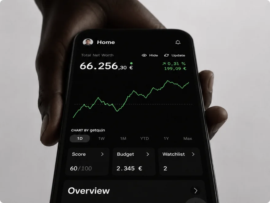
Portfolio Import
Redesigning the foundation of portfolio updates and manual import management.
Project scope
- Portfolio updates
- Manual and PDF import
- Scalable import architecture
Role
Senior Product Designer
Platform
iOS / Android
Team
Product Manager, Engineering, Data
Status
Gradual A/B rollout behind a feature flag
Why this project mattered
The import flow was not a setup detail. It was the first meaningful step toward the product’s core value.
Every new user had to import their investments before they could experience the real value of getquin.
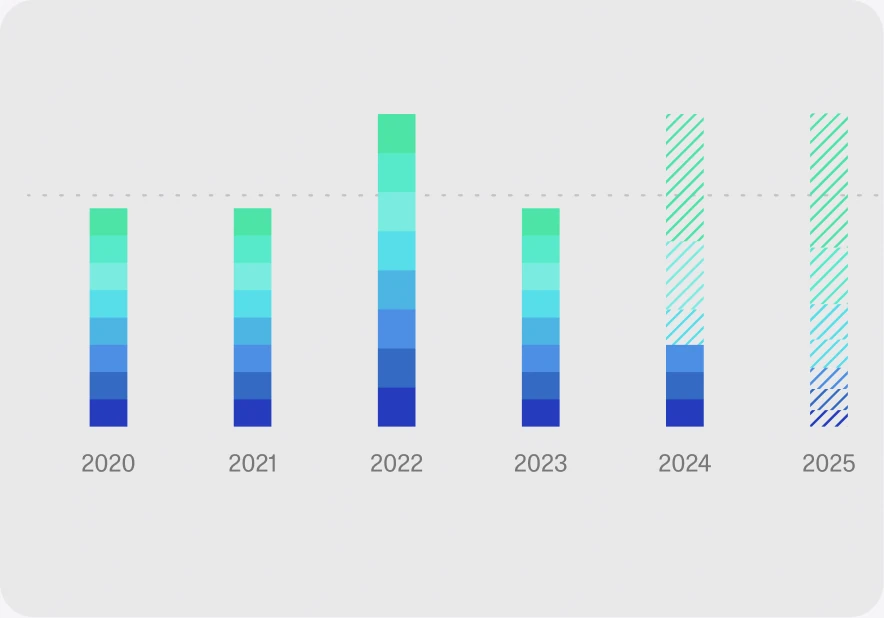
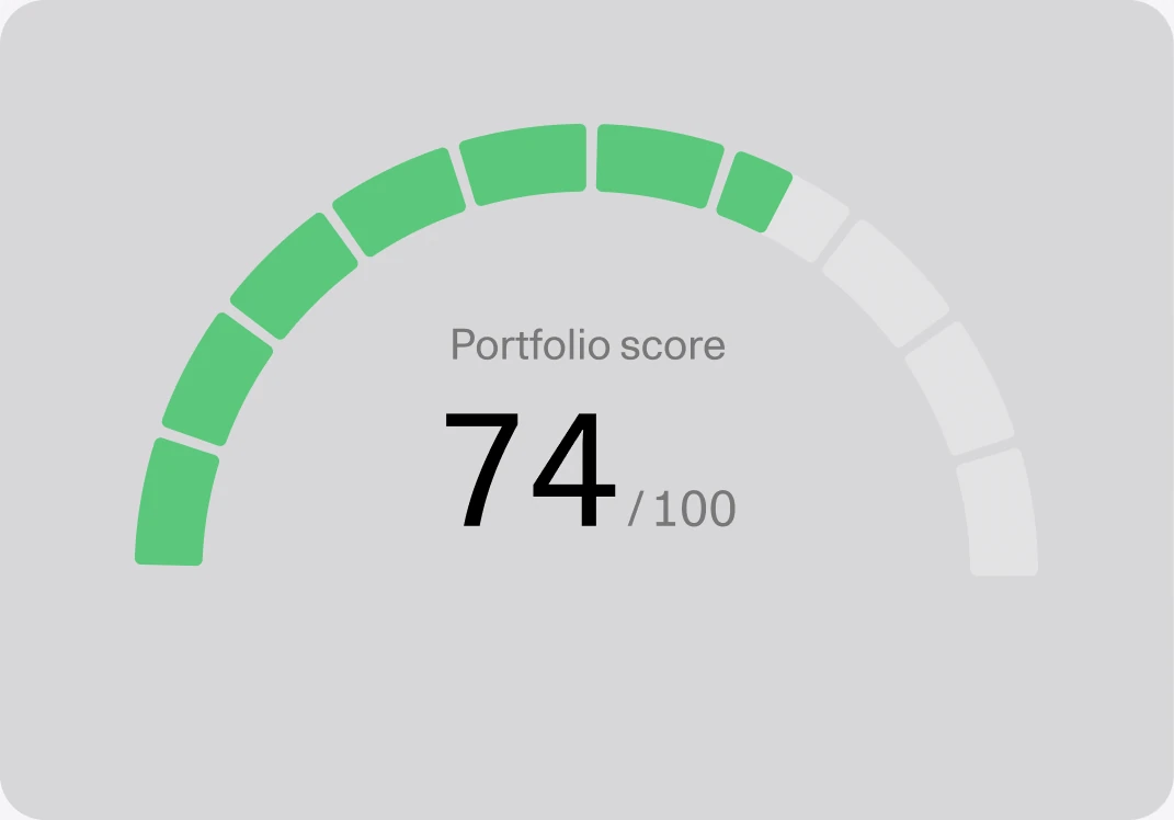
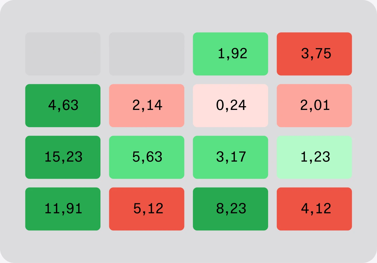
Until a portfolio is imported, users cannot fully access personalized value. such as:
- AI-powered portfolio analysis
- Personal dividend KPIs and forecasting
- Advanced performance analytics
- Detailed allocation breakdown
- Financial planning
The Challenge
The experience had grown into disconnected workflows that created friction for both first-time import and ongoing updates.
Speaker note
Frame this as a systems problem, not only a visual refresh. The redesign unified the mental model and created a more extensible import foundation.
Users had to understand asset categories before they could even search. Choosing the wrong category often led to empty results.
Initial import and portfolio updates used different patterns for the same user goal, increasing cognitive load and making the experience harder to remember.
Updating a portfolio using a PDF was buried inside the manual transaction flow, making an important capability difficult to discover.
The overloaded form could not scale to future import methods like CSV, AI-assisted import, or richer custom assets without adding more complexity.
Users could not quickly reuse assets they already held when adding or updating transactions.
Research & discovery
From symptoms to system-level problems
We used behavioral data, user sessions, PM context, competitor research, and product feedback to separate surface-level usability issues from the underlying system problem.
In parallel, I reviewed similar finance and portfolio tools to understand how they structure manual transactions, asset search, and portfolio updates.
Inputs analyzed
- Amplitude funnels – drop-offs and completion behavior
- Session recordings – hesitation, wrong category selection, repeated search attempts
- Competitor research – import patterns, asset search, update flows
- PM & product context – future import methods and scalability needs
- Support feedback - Add recurring user complaints once Customer Support replies.
Key takeaway
The issue wasn’t a hidden button. The product required users to learn different flows for the same task: adding or updating investments.




System reframing
From page-based to global import model
System shift
Before improving individual screens, we first changed the underlying import model.
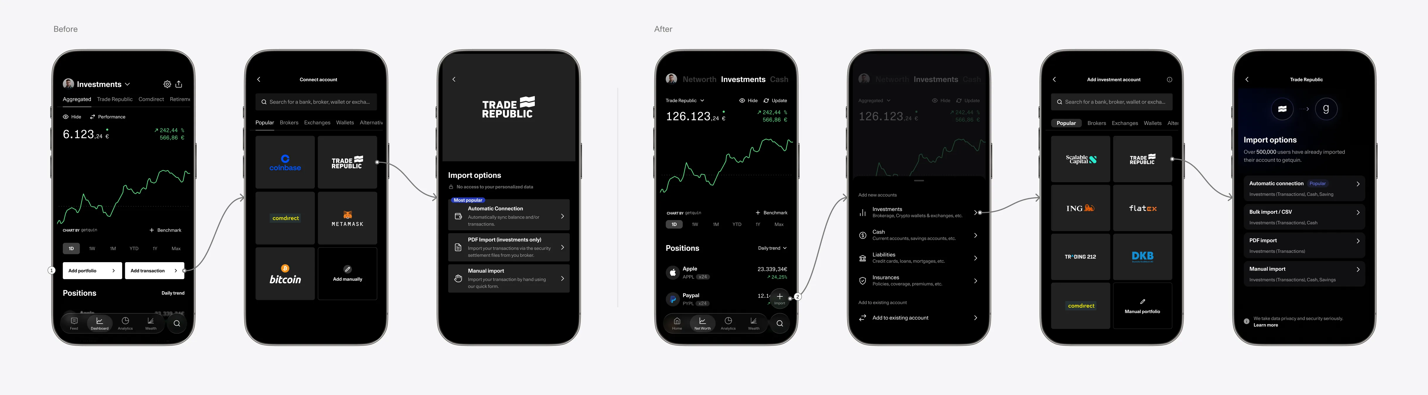
The old experience treated import as two page-level actions inside the Investments page: Add portfolio and Add transaction. This made adding and updating feel like separate flows, even though both belonged to the same portfolio management system.
We redesigned this into one global import entry point with two clear paths: add a new account or add to an existing one. This became the foundation for making PDF import more visible, simplifying manual import, and scaling the structure across different import methods.
Problem
Import actions were tied to one area of the Investments page. Because they lived inside the page content, they could disappear while users were scrolling.
The flow also sent users directly into provider or import-method selection before clearly separating whether they wanted to add something new or update something existing.
Solution
We introduced a floating import action that opens a shared bottom sheet for portfolio actions.
This made import accessible from anywhere and separated the flow into two clear intents first: add a new account or add to an existing one. From there, users could choose the relevant account type or import method in a more structured sequence.
Problem 1
Category-first search
Problem
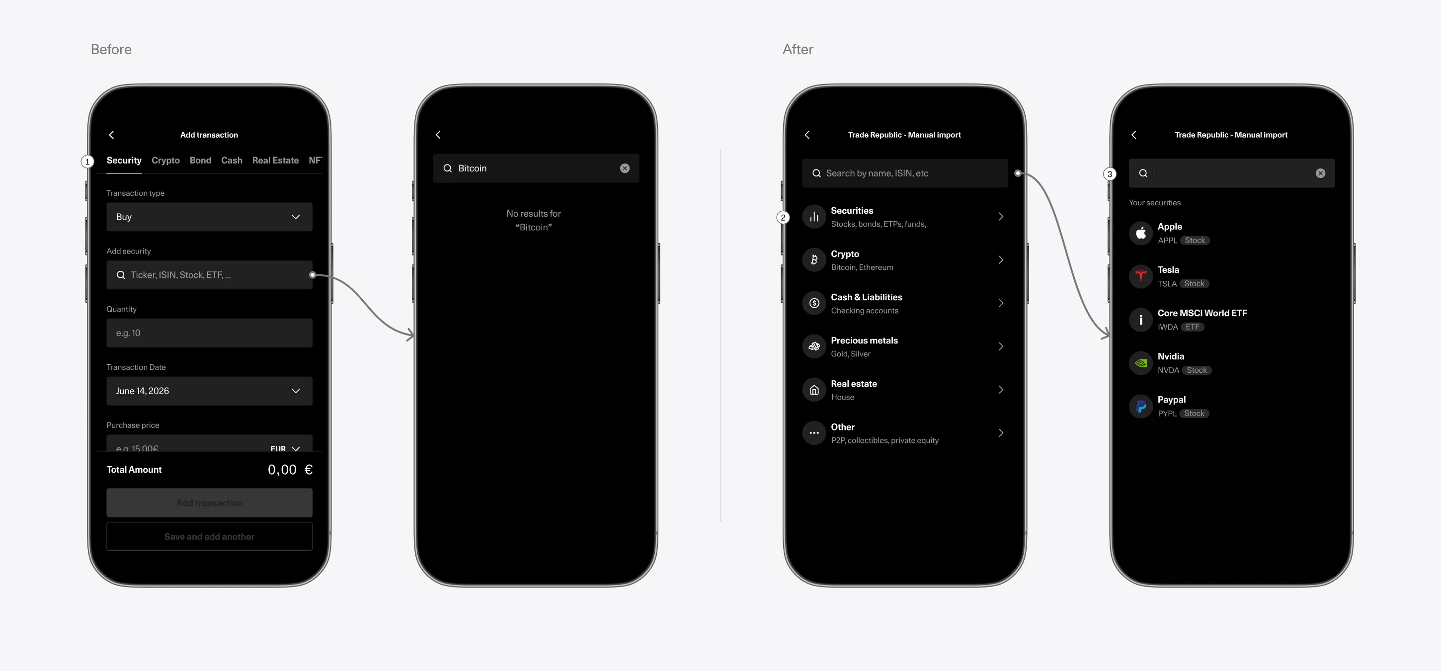
In the old flow, users had to decide whether they were importing stocks, crypto, cash, liabilities, or something else before they could search. That meant the product forced a classification step before helping the user find what they needed.
This created several problems:
- users needed an extra click before even starting
- users could search in the wrong category
- search results were artificially limited by the active tab
- a valid query like “Bitcoin” returned nothing if the user happened to be in the stocks tab
Solution
We removed the category tabs from the search step and introduced one search bar that works across asset types. This made the experience faster and more forgiving.
Instead of asking users to understand the system’s taxonomy first, the new flow lets them express intent directly through search.
Design rationale:
- fewer clicks before search
- less guessing upfront
- fewer false “no result” states
- broader, more natural search behavior
Problem 2
Hidden PDF updates
Problem
File-based updating was possible, but too hidden to feel usable.
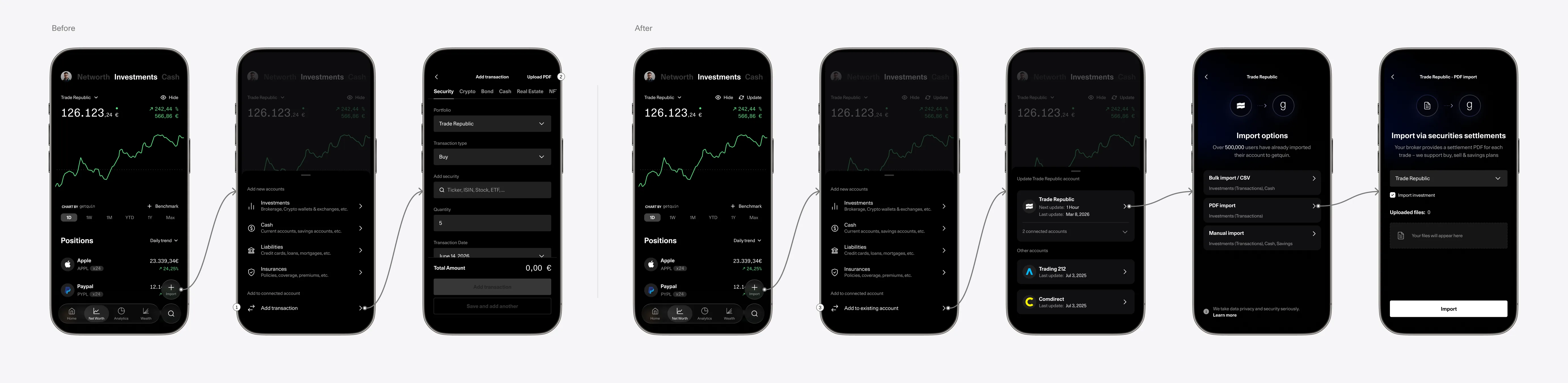
In the old flow, PDF import for updates lived inside the manual transaction form, behind a small upload button. Users who wanted to update an existing manual portfolio with a broker statement had to already know where that option was.
This was especially painful because manual/PDF workflows are common for brokers without strong API connections. A user could have one API-connected portfolio and another account where only PDF or CSV import is available.
But while API portfolios had a clear update path, manual/file-imported portfolios relied on a workaround. That made the experience feel inconsistent for users with more complex financial setups.
Solution
Making PDF import more prominent, helped prepare the product for a broader file import model to evolve toward a unified file import option that could eventually include PDF and CSV together. So increasing visibility for PDF was also about creating room for a more scalable import system rather than keeping file-based import as a hidden edge case.
Design rationale:
- surface a hidden but important update path
- support users with manual/file-based brokers
- create a foundation for a future broader file import pattern
Problem 3
Inconsistent update behavior
Problem
Users could have both API-connected and manually imported portfolios, but each type taught a different update behavior.
API-connected portfolios had a visible Update button. Manual/PDF portfolios could still be updated, but only through an indirect path inside the import flow.
This meant users had to remember a special case for manual portfolios, even though the task was the same: update their investments.
Solution
We introduced a visible update entry point for manual/PDF portfolios as well, making portfolio updates consistent across account types.
Design rationale:
- easier to understand
- easier to remember
- easier to extend with future import methods

Redesign principles
Before designing screens, we defined principles that would make the flow easier to use now and easier to extend later.
-
01 One mental model Importing and updating should feel like the same product behavior.
-
02 Progressive disclosure Only show what users need for the current decision.
-
03 Search first Let users search naturally instead of forcing category knowledge first.
-
04 Reuse existing context Previously held assets should be easy to find and reuse.
-
05 Future-ready architecture New methods should plug into the flow without adding clutter.
Rollout and measurement
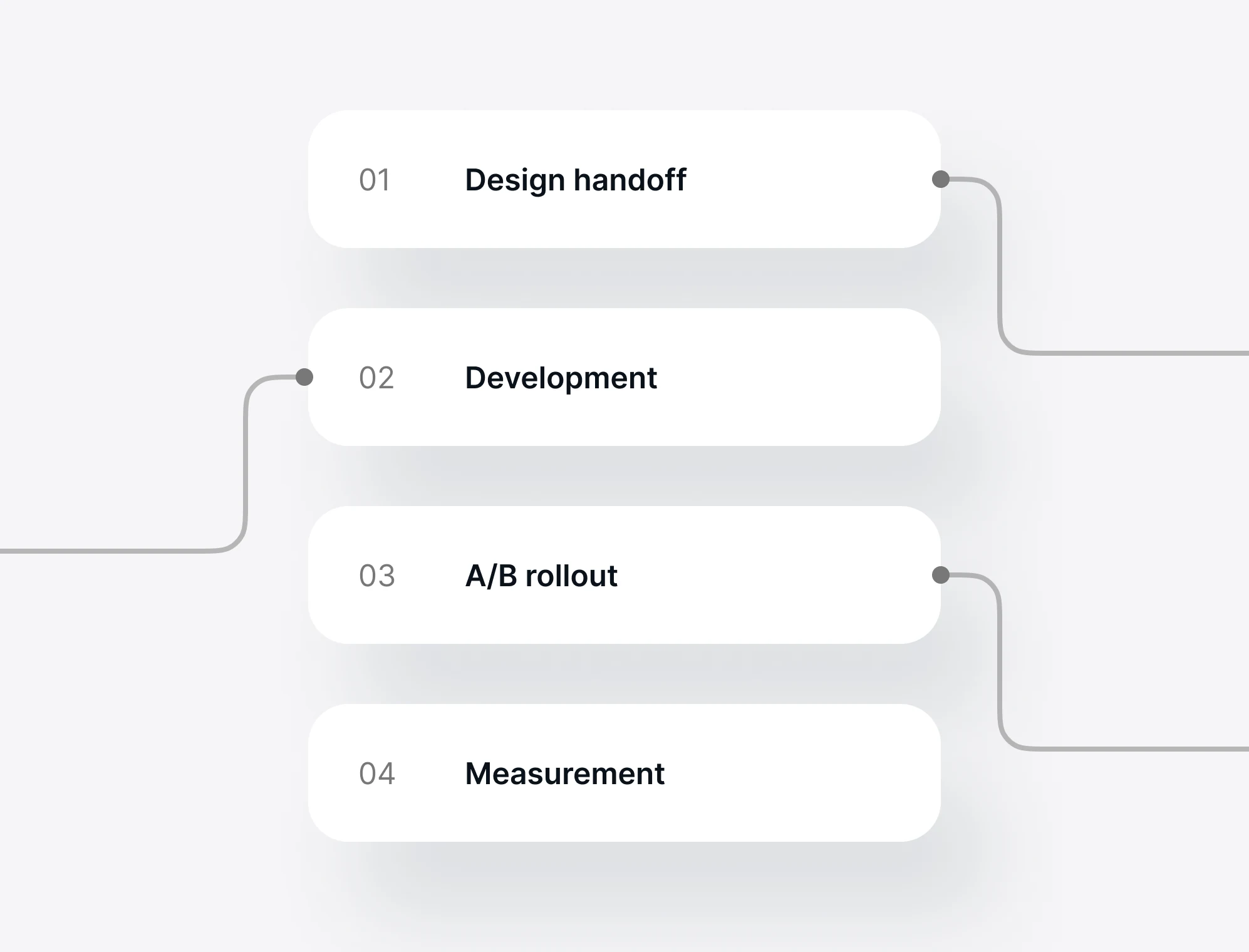
The new flow was released gradually behind a feature flag as a 50/50 A/B test for new users.
Experiment setup
- Released behind a feature flag
- 50/50 A/B test split
- New users only
- Experiment period: 1 month
Primary success criteria
- Manual import completion at onboarding - +5%
- Manual import median time - 1m45s
- CSAT - +0.15
Guardrail criteria
- Manual import completion - No decrease
- App Store rating - No decrease
- 30-day retention - ±0%
- CS tickets - No significant increase
Impact, learnings and hindsight
Early rollout signal
During the rollout, early funnel shared by the team showed a strong positive signal for the new flow.
What I learned
The redesign solved the main structural problems, but also showed that making a global action more scalable can make some familiar shortcuts less obvious.
Hindsight
If I continued iterating, I would make existing-portfolio actions more visible from the floating Import entry point, while keeping the broader add/update model intact.
Measurement note
This case study focuses on the design problem, system architecture, rollout setup, and early shared experiment signals. Final readout is not included here because it was owned by Product/Data.
Post-release feedback
Positive outcome
- The security class (stock, ETF, crypto, bond) is easier to find because the selection is clearer
- The search no longer looks only for securities in the selected class, so you can easily search for bonds without first selecting “Bond”
- Entering data is easier, since you no longer have to scroll back and forth; instead, all four pieces of information (type, date, units, and price per share) are visible at a glance
Next iteration
- Notes remained low-value because they were not searchable or reusable
- Taxes & Costs were still easy to miss
- Some users missed the existing-portfolio transaction path after it moved behind the floating Import action