getquin Product design
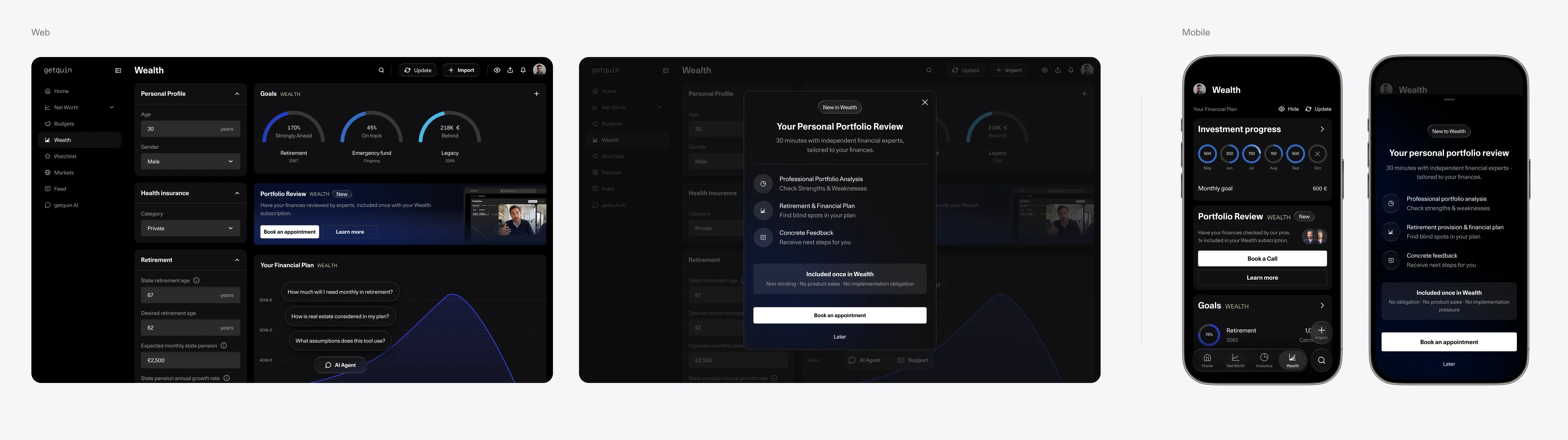
getquin is a Berlin-based investing platform that connects brokerage accounts, tracks portfolios, and provides insights and planning tools to help users manage their finances with clarity.
Wealth Management
Designing a free value layer that turned daily market checking into long-term wealth planning discovery.
Role
Senior Product Designer
Platform
Web / iOS / Android
Team
Product Manager, Engineering, Data
Focus
Financial planning, Growth, monetization, goal setting
Why this project mattered
A strong product value was hidden behind the paywall.
getquin had built a Wealth Management experience that helped users model their future finances, but many users never reached the point where that value became obvious.
Until users discovered Wealth, they could not:
- create a long-term financial goal
- connect daily investing behavior to future outcomes
- understand why Wealth tools mattered
- see how getquin could support their financial planning
- upgrade from free or premium with clear motivation
Improving this discovery path meant turning passive portfolio checking into a first step toward long-term wealth planning.
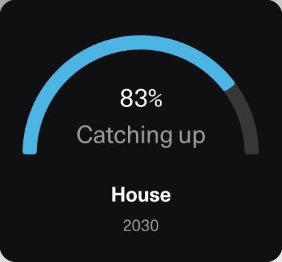
The Challenge
Users checked markets daily, but did not see why Wealth was relevant.
The issue was not that the Wealth product lacked value. The issue was that users did not experience enough value before the paywall to understand why they should upgrade.
This created several problems:
- Wealth felt disconnected from users’ daily investing behavior
- Long-term planning value appeared too late in the journey
- Upgrade prompts lacked enough context
- Users could ignore Wealth without understanding what they were missing
Strategy
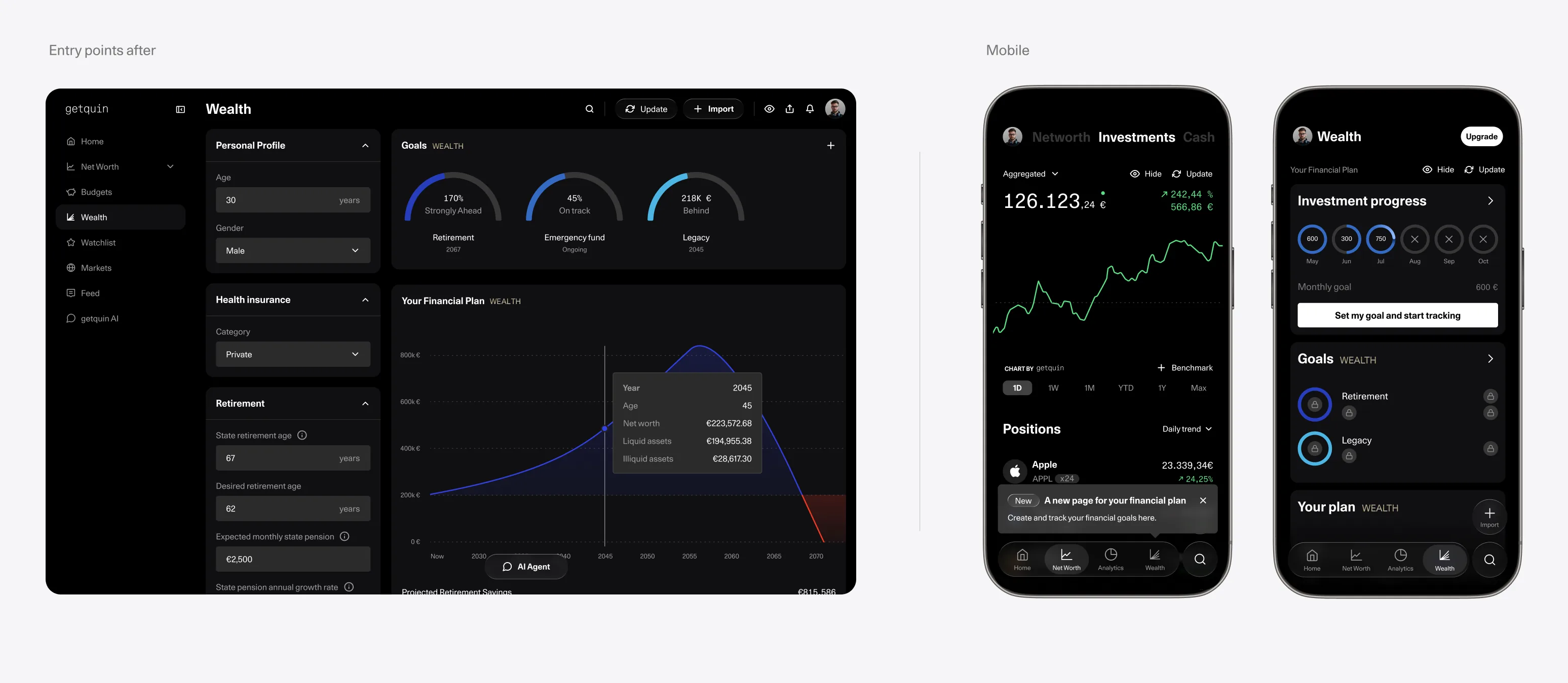
Create a dedicated Wealth entry point
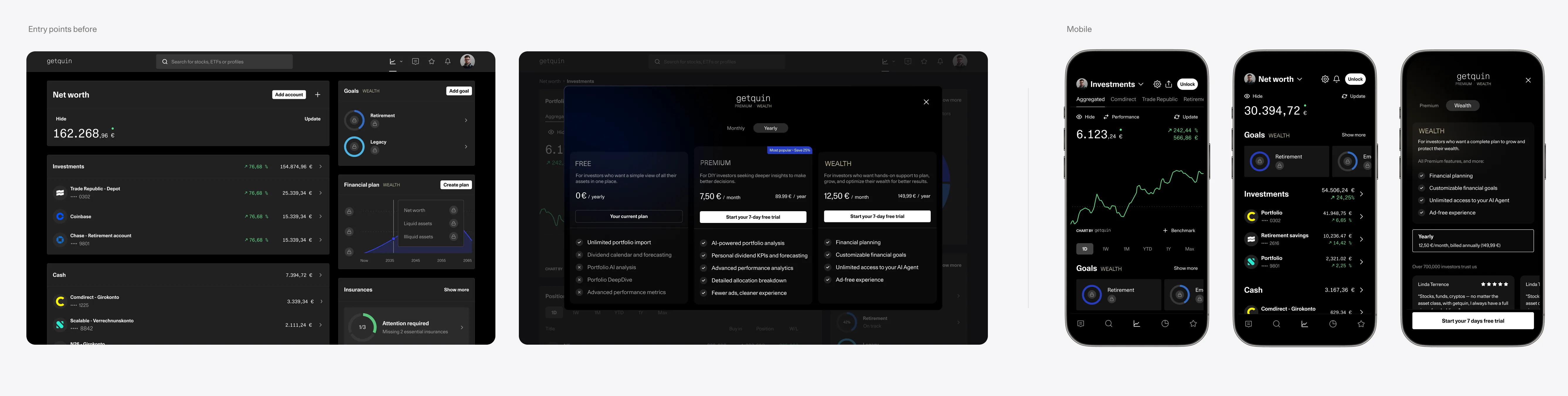
We created a dedicated Wealth entry point and introduced Investment Tracker as the first free layer of the experience. Previously, Wealth Management was mostly hidden behind small goal widgets across Investment and Net Worth, giving users little visibility into what the full product looked like or how it could help them.
The new structure let users try a meaningful part of long-term planning first, so the upgrade felt connected to value rather than a paywall.
Core hypothesis
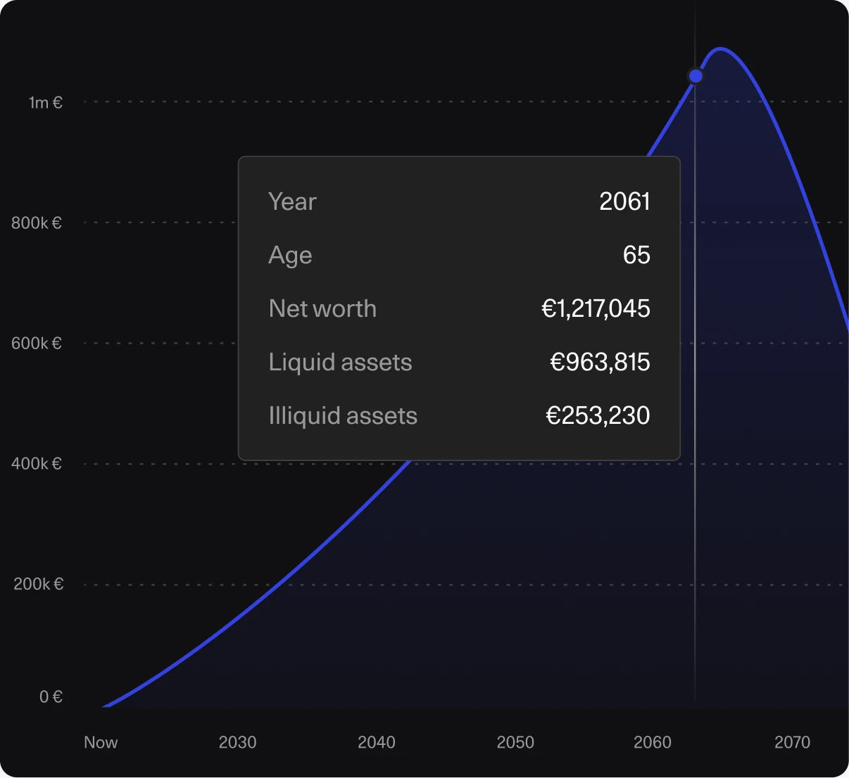
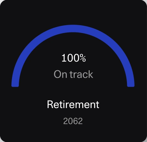
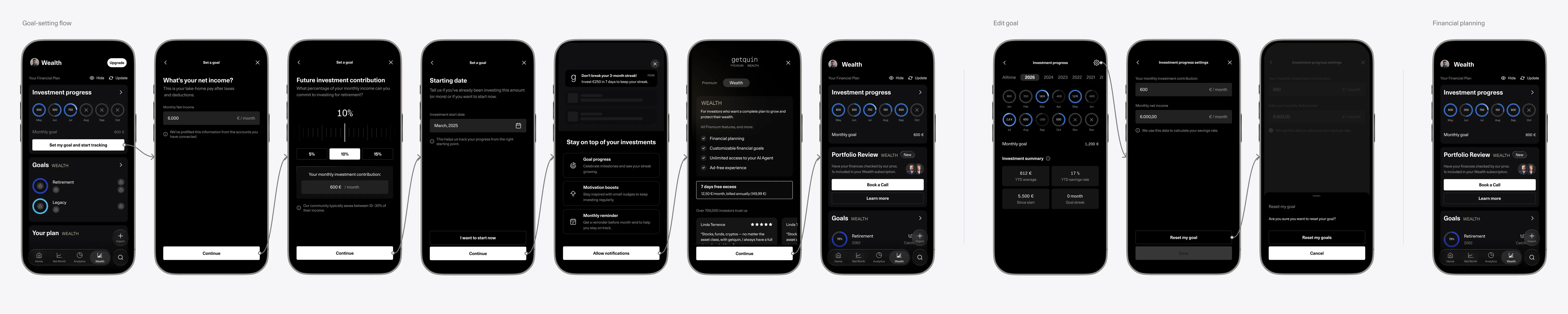
If users could see their long-term portfolio progress in a lightweight, motivating way, they would have a reason to return to the Wealth area more often, better understand the value of long-term planning, and be more likely to explore or upgrade.
The dedicated Wealth page also created room for future planning services like Portfolio Review, turning Wealth from a single feature into a broader destination for tracking progress, planning ahead, and getting more personalized support.
Insight
From daily checking to future planning
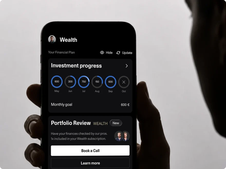
Users were already returning to check stocks, ETFs, markets and portfolio changes. Investment Tracker used that existing behavior as the entry point into long-term financial planning.
Design opportunity
- meet users where their daily habit already existed
- make goal creation feel lightweight instead of financial-planning heavy
- translate portfolio activity into future progress
- connect the free feature naturally to Wealth
UI direction
The interface needed to explain long-term progress in seconds, without feeling like a spreadsheet or a heavy retirement-planning tool.
Web version

Redesign principles
Make long-term planning feel immediate, visual and useful.
Before designing screens, we defined principles that would connect day-to-day investing behavior with the bigger Wealth proposition.
-
01 Show progress visually Make long-term portfolio progress understandable in seconds.
-
02 Keep goal setting lightweight Avoid making users feel they are filling out a full planning form.
-
03 Create value before paywall Let users experience a meaningful part of Wealth before upgrade.
-
04 Connect naturally to Wealth Make upgrade feel like the next useful step, not pressure.
Impact, learnings and hindsight
Early launch results showed the feature influenced Wealth behavior
Learnings
A free feature can sell the paid product by proving the value first.
The biggest learning was that monetization worked better when the free experience made the paid value easier to understand.
20%Wealth upgrades
came directly from Investment Tracker
25%Goal creation
of Wealth page viewers created a financial goal
+40%Wealth upgrades
compared to the previous week
Financial Advisor
We expanded the Wealth experience beyond self service planning by adding direct access to professional financial guidance.
Why it mattered
Financial Advisor extended Wealth from self serve planning into expert guided support for more complex financial decisions.
User value
Users could validate their long term plan with a professional and get personalized guidance.
Product value
It created another relevant reason to return to the Wealth area beyond tracking and planning alone.